


QoL UI Improvements For Visual Clarity
|
Suggested UI improvements;
- Please make the transparency/opaqueness option for the TAB mini map go higher. The contrast between the map and the background is not enough on certain maps, even when the slider is all the way up. That or let people choose the outline of the map's colour; the current periwinkle colour is not that great. Give contrasting options like neon green, neon yellow or magenta, like you do with the cursor options. - Please add the names of the co-op partners above their character's heads in game as an option in settings (so I don't have to hover my mouse over them to see who it is every time I'm in a fight and need to communicate mechanics or need to look at the mini map and try to figure out who is who in relation to the map while I'm getting pummelled to death by mobs/bosses) - Please, in similar fashion, put my co-op partners' levels above their names on the left side Party UI, where their names and pictures are. Example of maxed out transparency slider not doing much for visual clarity in The Drowned City: 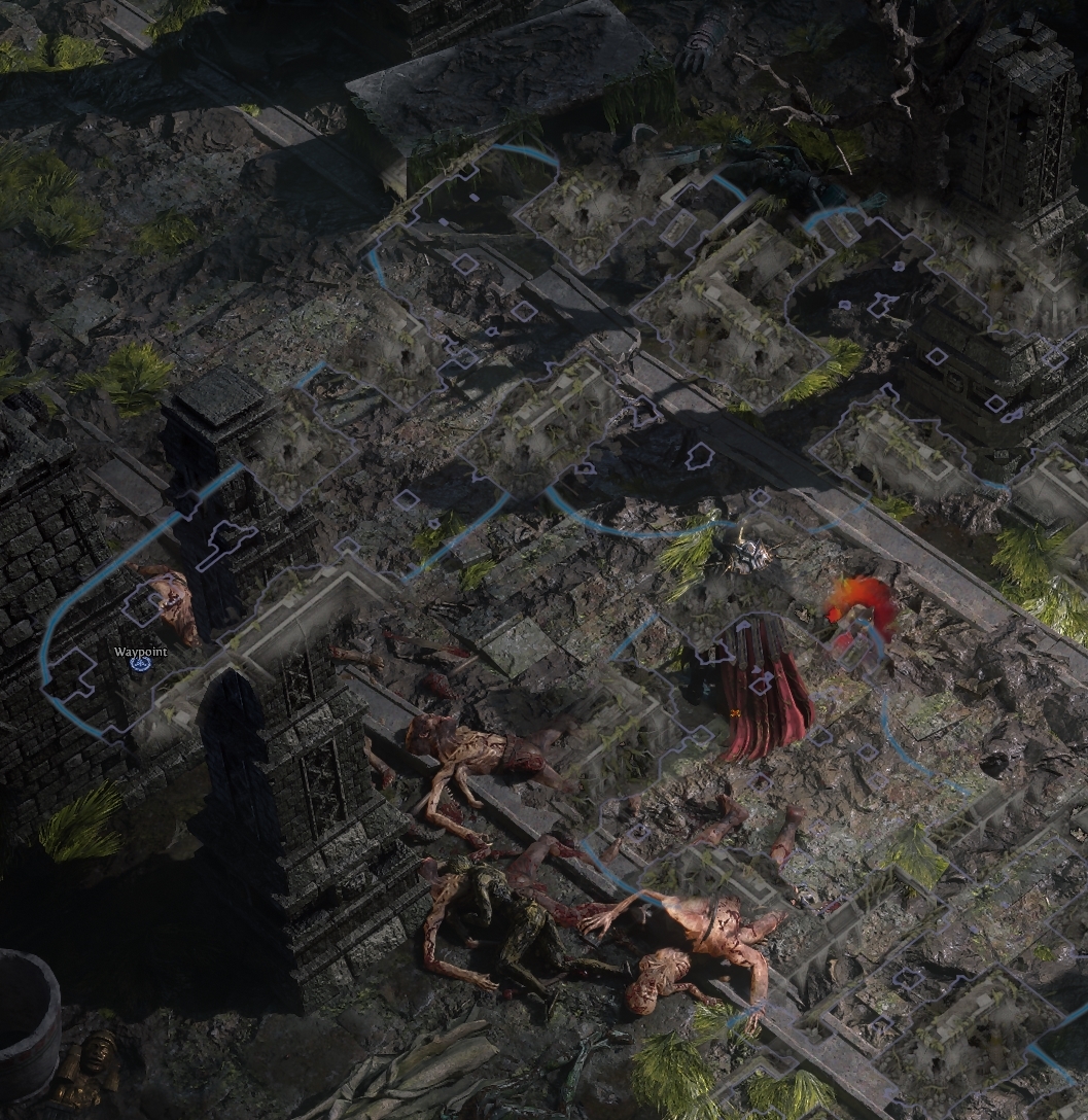 I'll edit in any other suggestions I can think of as I play. Zuletzt bearbeitet von HebiNiiChan#6085 um 14.02.2025, 15:17:51 Zuletzt angestoßen am 13.02.2025, 16:12:34
|

|

